Intro
In order to set up A/B testing, I had to find and locate any reasons why my goals in post 8 were not being met. At quick glance, it's easy to conclude that the "call to action" blends in too much with the rest of the page. There is really nothing drawing its attention. I've even been told by a few friends and family that they've clicked around, read a post or two, but they ignored the call to action link because they didn't think it was important. I was even told "it's not even in bold font."
Set Up
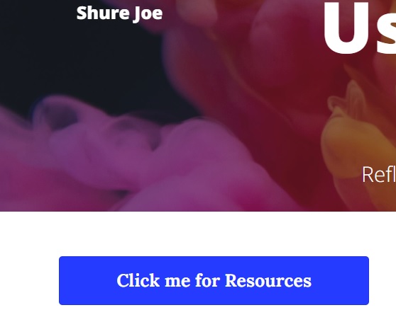
I'm using Google Optimize in order to set up my A/B testing. Specifically, I want to modify the call to action in order to get more clicks thus resulting in more goal conversions. My "original" will be the default page while the variant will look like:
 The link is styled as white text with a blue background, something that
stands out considering how black and white the content is.
It was important to me to make it clear to users that the link is important and that is should be clicked. By giving it visual hierarchy as well as more context by informing users to "Click me for Resources," I should in theory increase goal conversion rates.
Considerations
It will be very interesting to see how this experiment pans out. From the data that Google Analytics has retrieved since this page was first published, the general page flow from typical user activity is short. Users will generally exit after a page or two and navigation usually involves movement from the index page to a specific post. My bounce and exit rates are still in line with my past analysis from post 7 which backs up my theory that there isn't too much movement on my page. Hopefully the changes on the variant will remedy this.
Conclusion
I'll revisit this post in a few days once I've collected more data from friends and family. My gut feeling is that the variant will return more hits than the original page by a significant margin. Setting up experiments through Optimize was easy and I'm excited to see the results.